Nouvel Opera Fribourg Microsite
Overview
Role
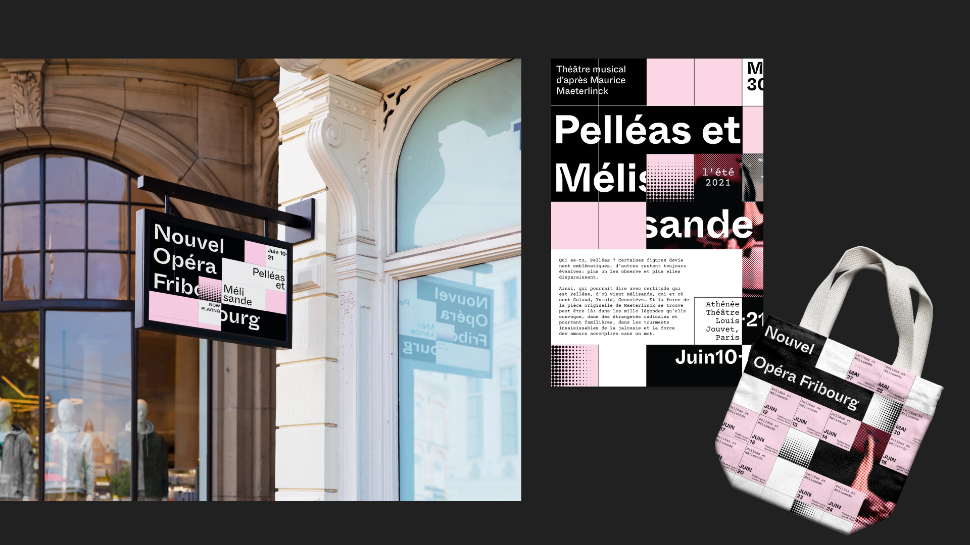
Over the course of six weeks, my team and I were tasked with developing a visual identity, derived from distinct qualities and principles of various designers, and creating a microsite for the Nouvel Opera Fribourg. The final experimental microsite focuses on visual design, incorporating aspects of interaction design, UI design, and content strategy built from the various weeks leading up to the final design.
Interaction Designer, UX Designer, UI Designer, Prototyper
Team
David Gu, Jacqueline Chiang
Tools
Figma, Axure, Adobe Illustrator, Adobe Photoshop
Understanding The Client
Nouvel Opera Fribourg is a Swiss-based performing arts center that produces an interplay of classical and contemporary musical theater and opera. By using offbeat practice and light-hearted humor, their live productions soften the divide between Western art forms of baroque lyricism and oral traditions.
The Journey
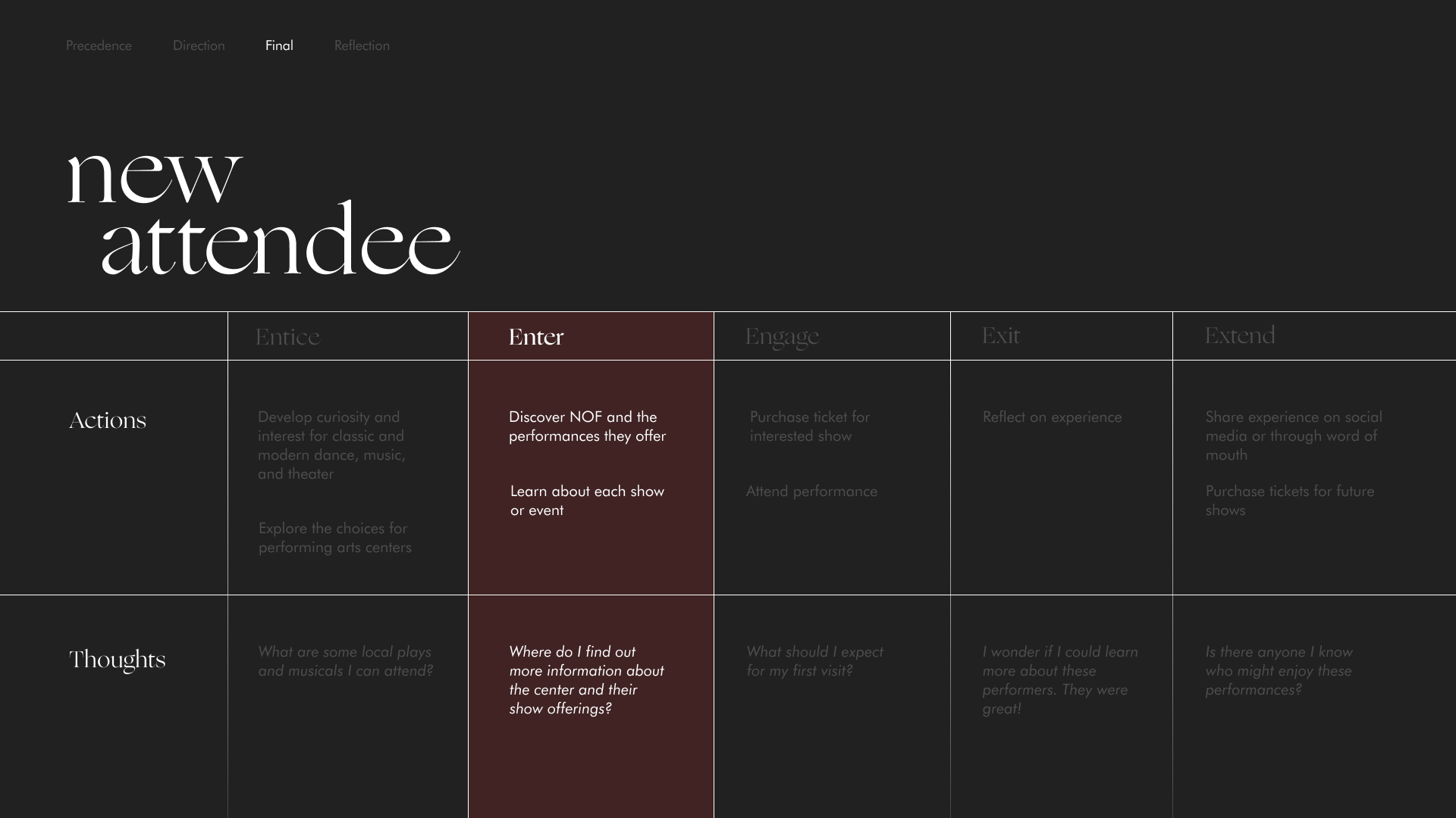
A future state journey map was created to identify the experience of a new attendee - someone who has recently developed an interest in the local performing arts. We chose to intervene at the enter stage as we perceived this as an ideal opportunity to assist with our persona’s biggest goal of being able to learn more about the various shows and events offered online.
Initial Explorations
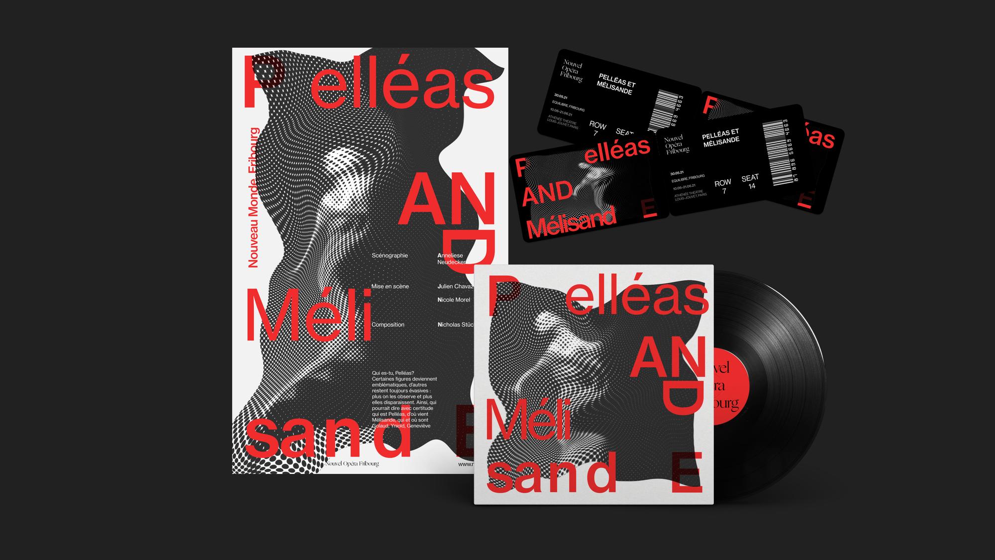
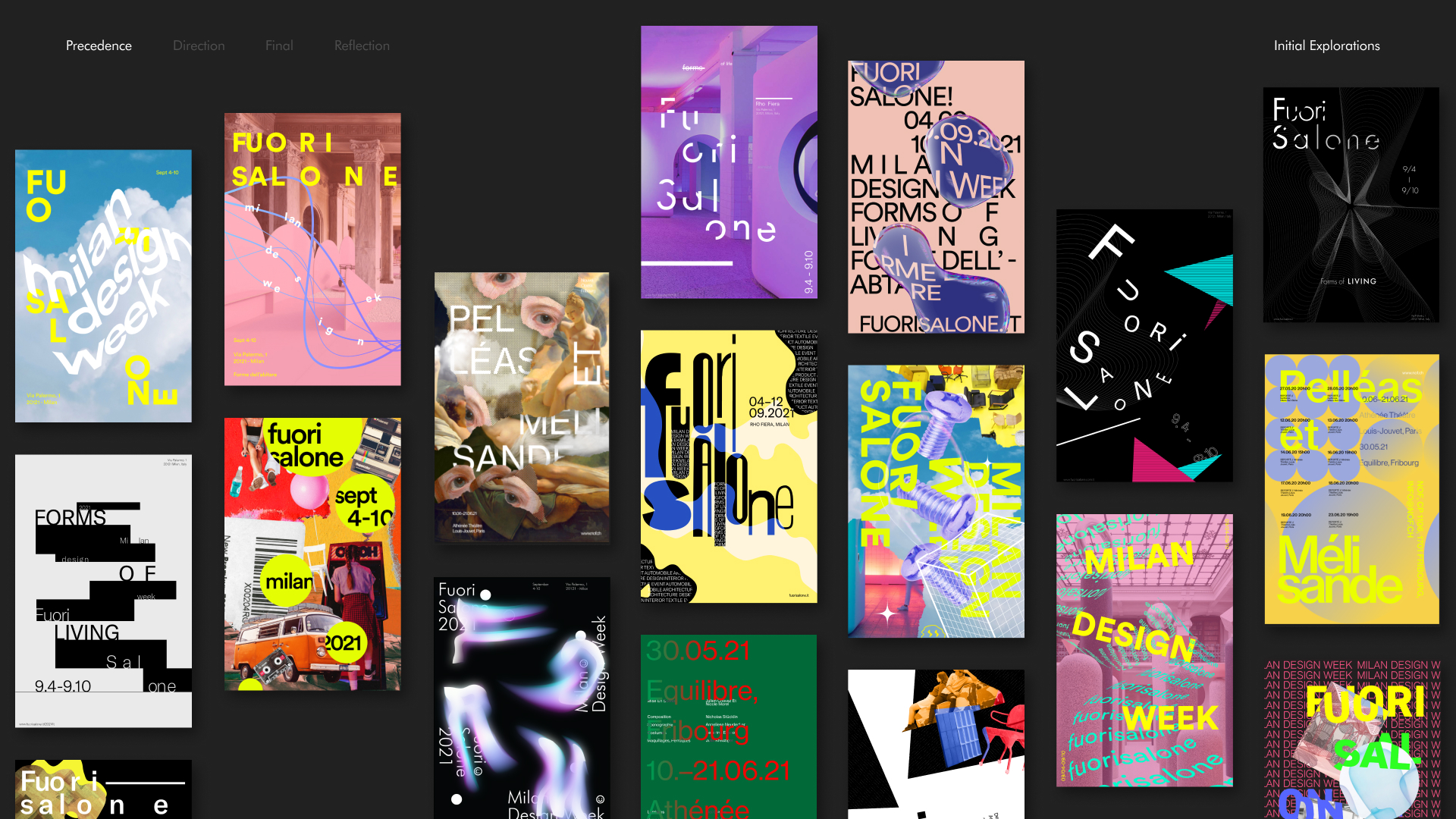
Our process in developing a visual identity began with a study of Dan Friedman, pioneer of radical modernism, pushing the boundaries between legibility and readability while embracing elements of expressionism. Through closely studying and breaking down his most prominent designs throughout history, we extrapolated three main design qualities:
- Disrupting monotonous readability
- Rhythm informing grid
- Cohabiting 2D and 3D forms
A variety of graphic compositions were then explored, blending Friedman’s different qualities with Ellen Lupton’s design principles of texture, framing, and layering. We chose these three principles as we believed they would lend themselves well to work in conjunction with Friedman’s philosophy of challenging legibility and readability.
Lateral Explorations
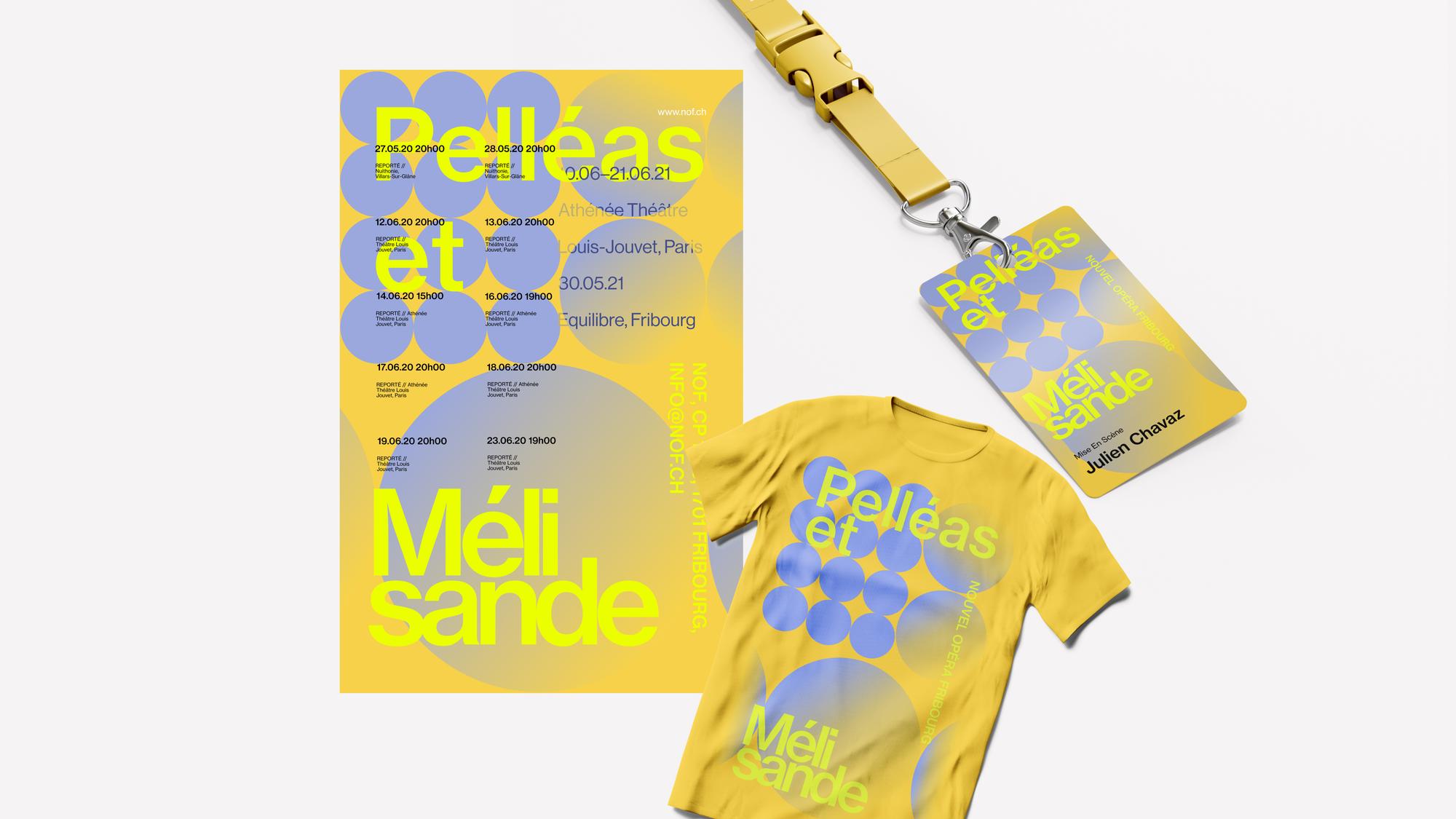
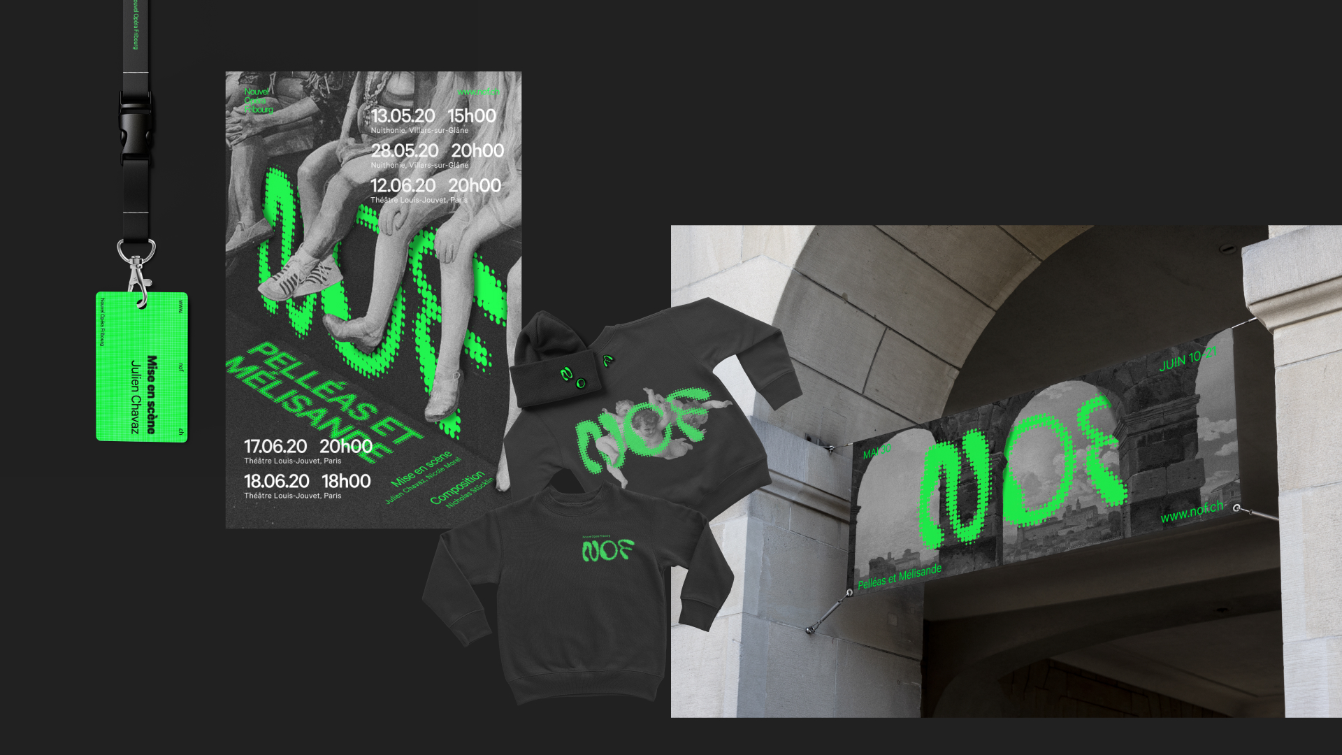
The next step of the design process was to see how well the visual identity expanded and adapted beyond a graphical medium. As such, various assets were created to observe how well they worked as an identity alongside the initial poster.
Three lines of investigation were developed further exploring Freidman’s design qualities with Lupton’s principles:
- Disrupting monotonous readability + layering shapes and colours + texture + framing
- Rhythm informing grid + layering of shapes and colours
- Cohabiting 2D and 3D forms + layering shapes and colours + texture
Further Explorations
We decided to move forward with the first line of investigation as we believed it provided the most interesting and unique identity that could be easily adapted to various mediums.
Working with our lateral design process, the first line of investigation and Friedman’s philosophy of challenging passive reading was further broken into an additional three lines of investigation exploring different specific techniques:
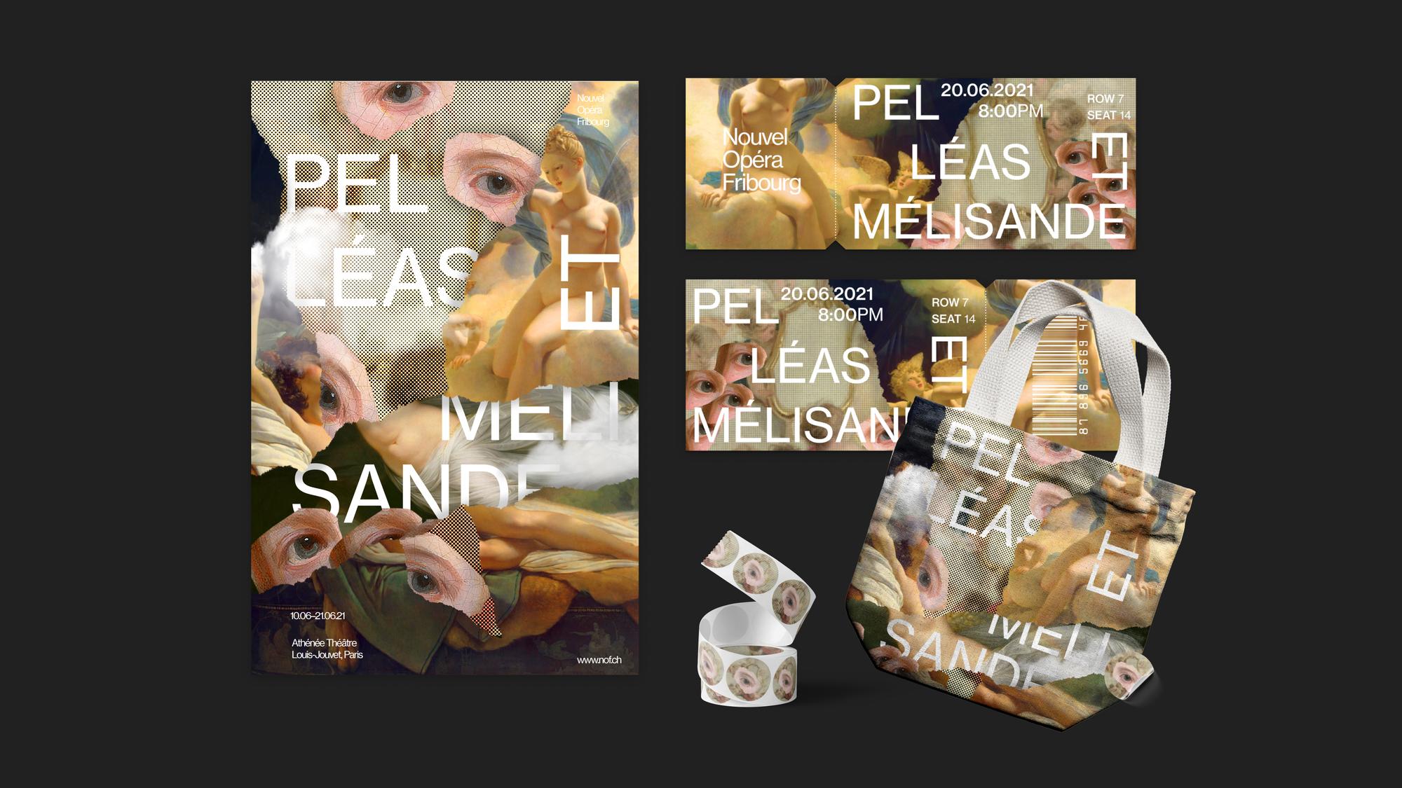
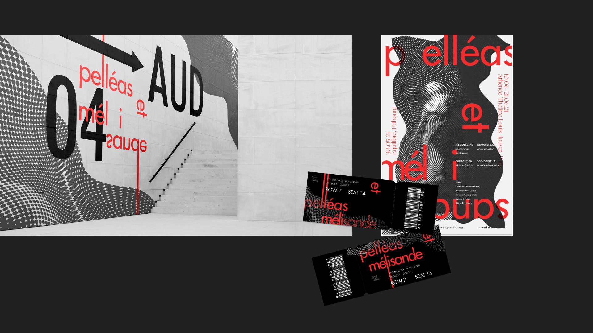
- Irregular spacing and contrasting styles
- Obstructing flow
- Interweaving type and image
The Final Direction
While many different avenues of approaching the disruption of monotonous reading were explored, we decided to move forward with the technique of irregular spacing and contrasting styles as this one provided a breadth of opportunities for dynamic and intriguing visuals which allowed itself to conform to a variety of forms in both print and digital mediums.
Marrying Concept and Interaction
For the final microsite, we understood that we couldn’t simply transfer our graphical print assets to a digital medium 1 to 1 if we wanted to create an immersive and memorable experience. Careful thought and intent was needed to bring life to the site through each interaction.
Landing Page
Denial and reward was identified as a method to achieve irregular spacing in a way that was ambiguous yet expressive and inviting. Fragmented text fades in to pique viewer’s interest and encourage exploration. Hovering over the various scattered letters would reveal the full show name, a quick synopsis, as well as textured organic shapes which would flow to frame the hovered show. As well, words are intentionally broken up as a reflection of Friedman;s quality of disrupting monotonous readability through irregular spacing.
About Klanggg
Not only would the about page provide a summary about the Nouvel Opera Fribourg’s Klanggg, a collection of six shows, the date, and the location, but also provided the various show offerings in a more legible manner for those who may have trouble making out the broken up titles in the home page.
Show Details
With the show details page, content about the show makes its way in and out of the screen through scrolling, interweaving through the title to breathe a sense of depth and multidimensionality. While images were presented warped and textured in graphical assets, expressiveness of the images on the site were toned down, to allow for easy previewing.
Purchasing Tickets
Broken up words are stitched together upon hovering to reveal the process information. Only the initial section headers were presented in a separated state so that functionality for ticket purchases would not be affected.
Reflection
Over six strenuous weeks, I had learned a lot about many facets of design including graphic, UI, and interaction design, but also about the design process. From the beginning we were taught and expected to avoid designing linearly, creating dozens of distinct designs in the initial weeks and slowly converging ideas and concepts as we progressed through our process.
Leading up to the first week of interaction design for this project, the team and I had initially decided to go forward with the concept of exploring disrupting monotonous reading through interweaving type and image. We thought the simplicity of the concept would allow for an easy transition from a static print medium to a digital one. However we soon found ourselves overly confined by the concept and unable to tie together the idea with any meaningful interactions, resulting in iterations that were left disconnected and without reason. Being stuck, we decided to revisit our previous explorations where we realized the potential of the final direction we moved forward with. With this experience, not only was time management crucial, having only 3 days left to create the prototyped microsite to meet the deadline, but I learned the importance of not getting overly attached to an idea and being able to pivot away if the idea isn't able to progress forward.
© Sean Jeong 2023
