UX Researcher @ Super
Overview
Role
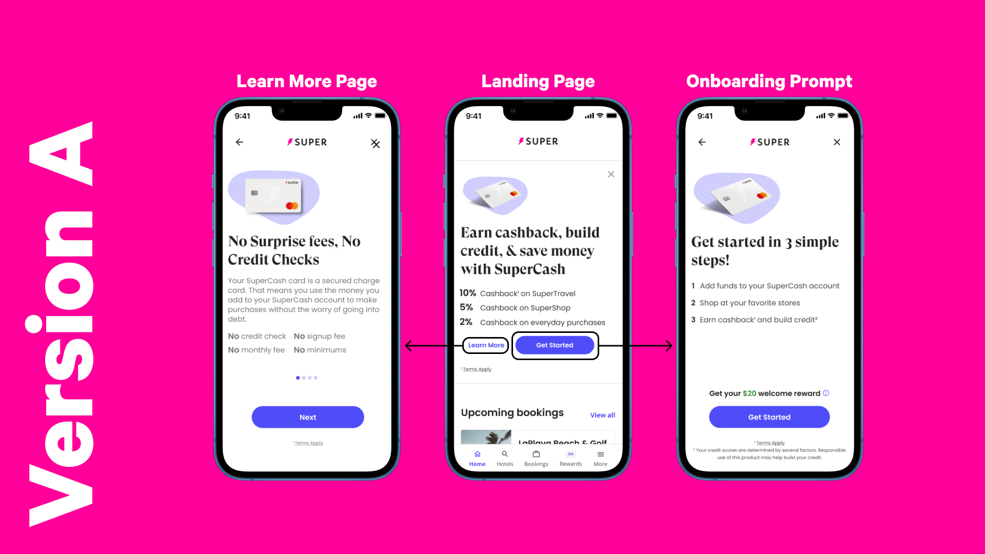
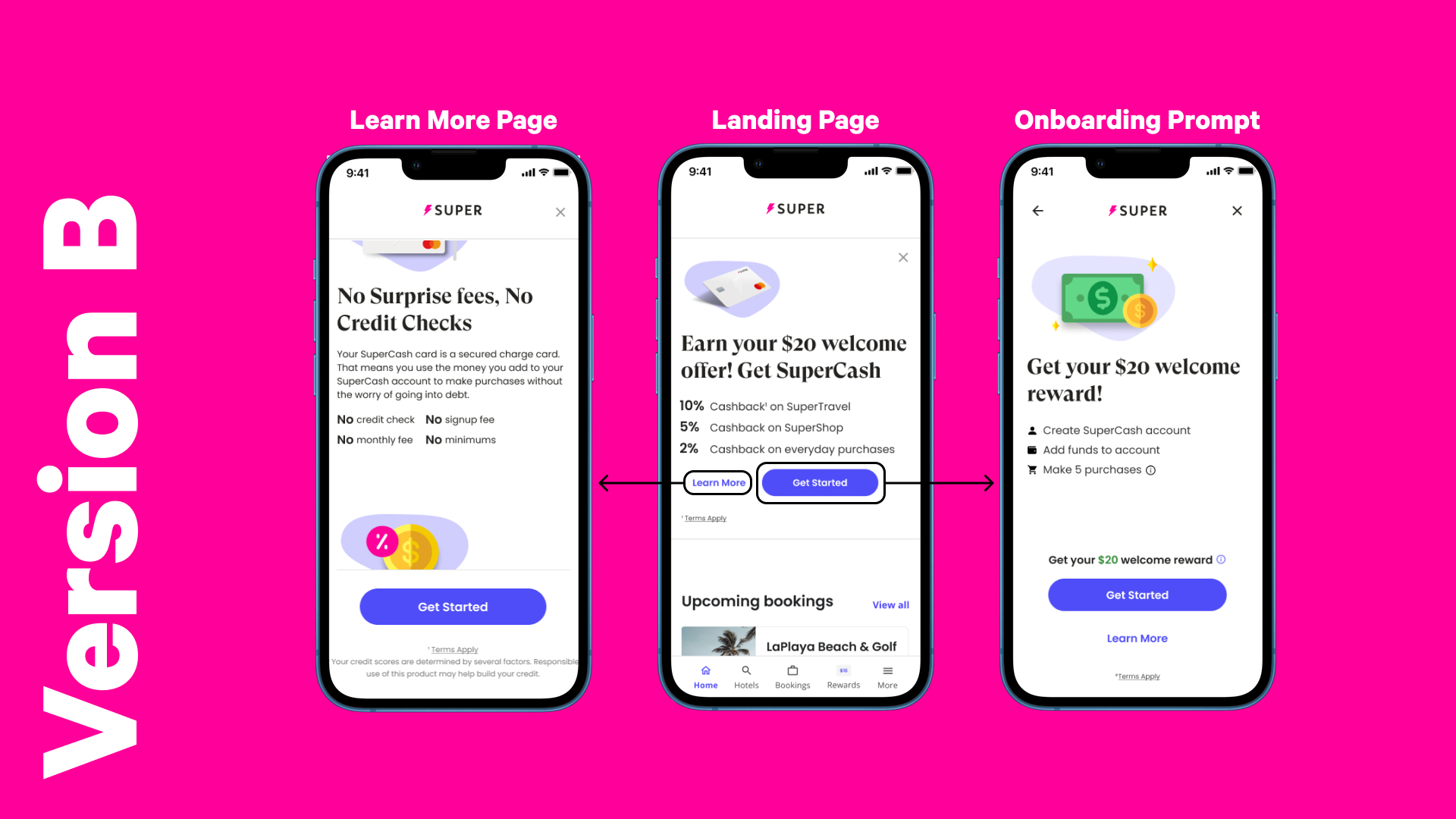
This project consisted of two A/B tests for Super (formerly Snapcommerce) with 30 participants total. The objective of the first test was evaluating the user's comprehension and perception of copywriting. The second test focused on determining whether user’s would prefer to scroll through a single page of product information or swipe through multiple broken up pages. These tests were done with prototypes of the SuperCash mobile app through Usertesting with first time participants.
UX Researcher
Tools
UserTesting, Zoom
What is SuperCash?
SuperCash is a secured credit card product. Using the card allows users to build their credit score, however, similar to a debit card, users need to add funds to their card in order to spend and can earn rewards such as cashback and more.
Background + Reseach Goals
With Super’s newest product SuperCash having been recently, at the time, released, the product team was looking to assess the onboarding experience from both a design and content perspective. Specifically, which version of the prototypes’ copy would best entice new users to sign up and which version was preferred from a usability design perspective.
Research Goals: Usability
- Gain insights into user’s thoughts and understanding of SuperCash
- Determine whether users would prefer the onboarding/product messaging divided onto multiple pages or on one page when learning more
- Evaluating which of the two variants is preferred and why
- Recommendations for improvements
Research Goals: Copywriting
- Gain insights into user’s thoughts and understanding of the copy within various pages
- Determine which copy best entices users to sign up
- Evaluating which of the two versions is preferred and why
- Recommendations for improvements
Planning
As the lead researcher for this project, one of my key responsibilities was ensuring that the research to be done was aligned with the needs of the product team. As such, it was pivotal for me to provide updates to, not only the product team, but the product manager. As well, it was also important to confirm the direction of the project at various milestones, such as after the initial plan and testing script had been finished, to listen to their input and make any changes accordingly.
During this initial planning phase, one concern that emerged was the length of the initial test. Due to the amount of tasks and questions, it would have taken approximately 40-45 minutes to complete the full unmoderated A/B test. As such, I proposed to separate the test into two separate ones, one focusing on copy and the other on usability. By doing so, it would minimize the chance of participant fatigue resulting in more engaged participants. As such, the project expanded from one test involving both copy and usability testing into two separate ones with 15 participants each for a total of 30.
Tasks
To achieve the different research goals, I had planned out the specifics and different requirements of this project which were put together into a research proposal document. As well, I built out the testing guide which included the different questions and tasks which were necessary, the order that they would each appear, as well as a post-test questionnaire. After the testing guide was finalized and approved, it was my responsibility to set up the test on the platform UserTesting. Finally, after all 30 participants had completed the test, I would code their answers, synthesize the insights, and put together a final report of the various findings and recommendations.
Method
For the purpose of this project, I planned and arranged an unmoderated A/B test, alongside a post test questionnaire for further insights into the participants' thoughts on the two versions of the prototype. This test was conducted with 15 participants for each test with a total of 30 participants. For the usability focused test, participants were asked to go through the process of learning more about SuperCash, going from the landing page to the sign up page. Participants of this test were presented two variants of the prototype, one which had a single scrollable learn more page and the other having the same content broken up into 4 pages they could swipe through. With the copy test, participants would go through the same process with different copy between the two versions and asked about which version best intrigued them.
Key Learnings
Usability
Two thirds of the participants had preferred version B (scroll) of the learn more page as they felt it was more compelling to read as they could go through at their own pace and were not forced to go through information they did not care to at the time.
Copywriting
The vast majority of participants had preferred the copy in version A, as they valued seeing the long term benefits and product information of SuperCash over copy around the initial welcome reward. As well, participants found themselves genuinely excited about the various benefits of SuperCash, however they struggled with identifying what kind of card it was and how it related to other Super products/offerings which could be attributed to the lack of clarity in copy around the product.
Reflection
This project was one of the first at my time with Super where, not only was I the lead researcher, but the sole researcher for this project. As such, I was tasked with many responsibilities to ensure that the research done was not only successful but rich and impactful. As the research team at Super worked in two week sprints, time management was a key aspect to help ensure the success of this project in a timely manner. As well, proper communication was also integral for this project. As mentioned above, I ensured to keep up communication with the product manager to ensure that the research goals aligned with what they were hoping to achieve with this project. This was further ensured by keeping them in the loop and asking for feedback at various points before the actual research such as going through the research proposal and reviewing the testing guide.
Overall, I believe this research project resulted in success, with the findings and recommendations I proposed having been implemented shortly after. As well, some of the findings around the copy and lack of clarity around what exactly SuperCash was had been echoed in previous research as well, meaning that the findings here helped to further support the push for more clarity around important product information.
Want To Learn More?
Ask me about some of the moderated usability tests I’ve done for Super or my experience with quantitative research!
© Sean Jeong 2023

